international review of exhibitions and books on art
Winter 2012
 Karen Wilkin
John Marciari
Christina Kee
Ariel Plotek
Christopher Nygren
Larry Bell
Karen Wilkin
John Marciari
Christina Kee
Ariel Plotek
Christopher Nygren
Larry Bell

Editor's Note
I am pleased, once again, to present a new issue of Tabula Quarterly. Still in its infancy, the journal continues to develop, expanding the scope of its contributors, and adding a new feature: an archive of past issues. While the quarterly moves closer to its aim of providing a survey of a season in art, comprising an international review of exhibitions, other goals remain to be realized. Book reviews and contributions from writers are notably absent from the present issue. As a commissioning editor, my hopes for the journal remain ambitious and inclusive. It gives me special satisfaction on this occasion to include a contribution from an artist alongside reviews by distinguished art historians and critics.
While the number of subscribers to Tabula Quarterly continues to grow beyond the confines of the museum and the university, the journal's ability to bring together the best writing on art from all manner of contributors will be the true test of its mission. I take this opportunity, therefore, to invite proposals for the spring issue, reviews of books on art as well as exhibitions. The journal has found its feet, and I invite you to join us at it takes its next step.
Ariel Plotek
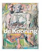
De Kooning: A Retrospective
New York
Catalogue edited by John Elderfield. New York: The Museum of Modern Art, 2011.
Just as Claude Monet is the sole Impressionist whose work consistently embodied the movement's desiderata, Willem de Kooning is the one painter among the Abstract Expressionists whose work always seems to embody the text-book definition of their approach: gestural, layered paint application, indeterminate form, a sense of contingency and open-ended possibility. In the 1950s, de Kooning was so widely perceived as the quintessential Abstract Expressionist and had accumulated so many imitators that Clement Greenberg coined the phrase "the Tenth Street touch" to describe the most salient aspect of this new academy of the vanguard. Yet, at the same time, de Kooning was also an anomaly, an artist who remained faithful to traditional conceptions of what painting could be while his friends and colleagues were apparently changing those conceptions forever. Where Jackson Pollock poured, threw, and dripped house paint on expanses of cotton duck placed on the floor, reserving decisions about dimensions and orientation until he had completed the open web of disembodied strokes, de Kooning worked at an easel, on stretched canvases, usually employing brushes and responding to the proportions of the rectangle. Yet this seeming conservatism may, in fact, have been the most radical aspect of de Kooning's work: his defiant refusal to abandon the incipient illusionism, the sense of volume, and the animated space of traditional painting, despite his commitment to a voluptuous type of "abstractness." Indeed, de Kooning's most adventurous works could be described as paradoxes that explore time-honored values in wholly non-literal, 20th century abstract terms—if he was ever an abstract painter in the first place. But de Kooning generally resists definition. He was a shape-changer, capable of working in different modes at the same time, shifting emphasis from abstractness to figuration and back again, reveling in the material sensuousness of paint or the incisiveness of line, testing the limits of suavity and brutality, pushing color towards cloying sweetness and retreating to black and white. And more.
The Museum of Modern Art's well-chosen, eye-testing survey, De Kooning: a Retrospective, organized by John Elderfield, Chief Curator Emeritus of Painting and Sculpture, and seen from 18 September, 2011, through 9 January, 2012, offered an opportunity to consider this perplexing painter whole, from student work, made before the eager young hopeful left his native Rotterdam to sad, problematic late paintings, made when the octogenarian artist's faculties were severely compromised. The selection of paintings, works on paper, and sculpture, spanning seven decades, ranged from iconic, celebrated works to less familiar or rarely seen efforts, from meticulously rendered figures to pared-down accretions of wristy, linear strokes; there was even the remarkable, disturbing Backdrop for "Labyrinth" (1946, the Allan Stone Collection), with its combination of pastel hues, implicit geometry, and floating biomorphic forms. We could watch the academically trained de Kooning, newly arrived in New York, turning himself into a modern painter, responding to his discovery of Henri Matisse and Joan Mirò, and perhaps even more importantly, to the helpful advice of the adventurous painters he called "the three smartest guys on the scene: [Arshile] Gorky, Stuart Davis, and John Graham." De Kooning called these unlikely friends, united by their common dedication to modernism, "the Three Musketeers" and joined them as d'Artagnan did Alexandre Dumas's swashbuckling heroes. The immensely knowledgeable Gorky and the young Dutchman became so close that de Kooning often gave the address of his friend's Union Square studio as the place he "came from"—a shorthand explanation of his aesthetic indebtedness. His hyper-refined figures of the late 1930s and early 1940s, such as the uncanny Seated Figure (Classic Male), (c.1941-43, Private Collection), teetering between exquisite fidelity to appearances and bold fragmentation, offer vivid testimony to the connection between the two artists.
Those delicately rendered figures soon evolved into the ambiguous, unstable forms of Pink Angels (c. 1945, Frederick R. Weisman Art Foundation, Los Angeles) signaling an apparent retreat from recognizable imagery that culminated in the eerie black and white abstractions of late 1940s—paintings that seem perpetually in flux, subject to slippage, subsidence, and transformation. Works such as MoMA's Painting, 1948, with its overlapping, momentarily assembled planes, established de Kooning as what Greenberg called "an outright 'abstract' painter," in a review of his first solo exhibition. The irascible critic also referred to him as a "late Cubist," as if interpreting the painting's sliding biomorphic elements as updated versions of Cubist fragments. Yet the black "planes" in these works, far from being conceived as a kind of accumulation, prove to be illusory, their fleeting solidity created by fluent, delicate drawing with white enamel on a loosely brushed expanse of black. The implied mobility of these sinuous lines suggests that in subsequent "off-white" works, with small notes of color, such as the pivotal Excavation (1950, Art Institute of Chicago), the white paint simply flooded the underlying dark continuum, silting up the surface and drowning everything; aggressive drawing, made by masking with tape to produce a crisp, sharp-edged line—black against smudged, sullied white—reasserts de Kooning's distinctive vocabulary of mobile shapes, making the distinction between positive and negative and, often, between near and far, irrelevant.
As installed at MoMA, Excavation seemed to sum up everything de Kooning had been wrestling with up to then, marking the climax of what many of us find to be his most moving and mysterious paintings, and intensifying the impact of what was to come. Not that the next group of works needed any intensification: the notorious series of Women, blowsy, pneumatic, "don't mess with me" broads who leer back at us. Painted between 1950 and 1953, they looked as startling as ever, poised between the Grand Manner and the cartoon, their bawdy, clearly recognizable imagery still deliberately transgressive, despite gorgeous, layered, wet-into-wet paint handling that seems emblematic of "orthodox" Abstract Expressionism.
Orthodoxy of any kind was obviously anathema to de Kooning. As the Women—and everything subsequent to the Women—made clear, whatever the prevailing attitudes towards abstraction, flatness, and expanse might be, he was unwilling to ignore anything as a starting point for painting or drawing: women, bicycles, clam diggers, boats, the light-struck landscape of Long Island, and more, all of it translated into celebrations of the painterliness of paint or the responsiveness of charcoal to the hand. After the Women, one extreme of de Kooning's aesthetic spectrum was marked by the generously scaled "landscapes" of the late 1950s and early 1960s, their swaths of clear color applied with what he called a "full arm sweep." In the best of these, such as Bolton Landing (1957, Collection Irma and Norman Braman, Miami), the ample swipes seem to distill the large phenomena of architecture and the natural world into painterly terms. At the other end of the spectrum are the insistently pink, light-weight nudes and the more convincing, but often equally pink, figures in a landscape, made from the mid- to late 1960s, evidence of a persistent desire to reveal a painting's past stages, as well as to imply future possibilities, while celebrating the physical fact of paint. In the oddly "unsculptural" bronze sculptures of the 1970s—unsculptural in their apparent indifference to articulation in space—this provocative assertion of mutability, along with the paintings' potent sense of materiality, become arbitrary agitation.
Fortunately, it was possible to ignore the sculptures and concentrate on the limpid calligraphic paintings of the 1970s and "ribbon" paintings of the early 1980s. Whose Name is Writ in Water (1975, Guggenheim Museum) is as fluid and luminous as early works such as Excavation, its dragged, overlapping passages of color informed by similar rhythms, despite the altered scale of the mark. Paintings of this type fray and decompose by about 1983, when de Kooning's health began to decline, but his ability to draw expressively at large scale, as well as to orchestrate lines and gestures of different weights, remained intact. The gestures seem to describe a spatial journey, even when repetitions of identical, unmodulated colors tend to flatten things out. By contrast, the last works in the exhibition, made in 1987, three years before de Kooning's failing mental acuity forced him to stop painting, seemed like mere diagrams, ghosts of early works, still informed by that extraordinary gesture, but flat and empty.
Today, when artists routinely work in multiple modes and mediums, de Kooning's restless shifts are readily accepted and may even enhance his posthumous reputation. But in his life time, when the "signature image" was deemed to be an essential declaration of individuality and abstraction was believed to be more "advanced" than figuration, his desire for reference, allusion, and implied space, in place of non-associative imagery and literal flatness, was seen as a betrayal of principles—for all his glorying in the painterliness of paint. Yet just as T.S. Eliot advocated, in Tradition and the Individual Talent, de Kooning seems to have aspired both to honor the excellences of the past and make them modern, aiming to make a new kind of picture out of his willingness to experiment and his deep understanding of tradition, exploring different degrees of reference and a variety of spatial languages. De Kooning: a Retrospective made him seem no less enigmatic and hard to classify than before, but it convinced us of the high seriousness and intensity of his quest.
Karen Wilkin
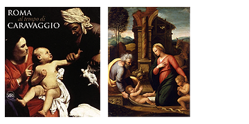
Back To ContentsRoma al Tempo di Caravaggio, 1600-1630
Rome
Catalogue edited by Rossella Vodret. Rome: Museo Nazionale di Palazzo Venezia, 2011.
Il Rinascimento a Roma: Nel Segno di Michelangelo e Raffaello
Rome
Catalogue edited by Maria Grazia Bernardini and Marco Bussagli. Rome: Fondazione Roma, 2011.
Visitors to Rome this season were able to take in two shows that, superficially at least, seemed cut from the same cloth: Il Rinascimento a Roma, which surveyed Roman art ranging across the entire cinquecento, and Roma al Tempo di Caravaggio, which focused on Roman painting in the first decades of the seicento. Both represented ambitious undertakings for their respective venues, both had designer installations, and both combined familiar works from major museums or churches with other works from private or otherwise relatively inaccessible collections. Although neither had major loans from British or American collections and seem therefore to have slipped somewhat under the Anglophone radar, both exhibitions certainly deserve note, for such visual surveys—including a good number of unfamiliar works—are well worth seeing. Beyond these points, however, the similarity of the two exhibitions breaks down, for where one show deserves great credit for the beauty of its display and the wisdom of its installation and juxtapositions, the other, alas, left the serious visitor with emotions ranging from perplexity to annoyance to amusement; one would occasionally be pleased (mainly to see some new curiosity), but above all, the inevitable final response was critical.
To begin with the good news: Roma al Tempo di Caravaggio at the Palazzo Venezia, curated by Rossella Vodret, was among the finest exhibitions I have ever seen in Rome. I state this in full awareness that the public reaction to a "Caravaggio show" with only a single Caravaggio (and a new contender for that attribution, about which more below) and 130 other paintings must be rather different. One wonders whether exhibitions really have more to say about Caravaggio himself right now, but this show was a scholars' and specialists' delight in tracing the extent and variety of Caravaggio's influence on a generation of Roman painting. As such, the exhibition covered much the same ground as the enormous and important Caravaggio e l'Europa exhibition held in Milan in 2005, but the new show, limiting itself largely to works made in Rome and organized with a more rigid chronology, offered a more focused view, taking up the question of Caravaggio's influence by also examining alternate stylistic options open to painters in Rome around 1600.
Upon entering the show, one was faced with the juxtaposition of Caravaggio and Annibale Carracci, but the pictures presented here breathed a bit of new life into this mainstay of art historical lectures. Rather than the all-too-familiar confrontation of the works from the Cerasi chapel, that is, the exhibition paired Caravaggio's Madonna of Loreto with Annibale's relatively little-studied painting of the same subject from the church of Sant'Onofrio. Even if the latter included the participation of Annibale's workshop, the pairing of the two works, both painted in 1604-05, was a brilliant introduction to the main theme of the exhibition. From there, the visitor moved to a wide room with 17 large altarpieces. These works documented the trends other than caravaggismo that were evident in Roman public commissions from 1600-1630, from Giuseppe Cesari (and an early Cesaresque altarpiece by Baglione) and the Tuscan naturalists (Bilivert, Ciampelli, et al.) on through Annibale, Guido Reni, Lanfranco, Guercino, and Pietro da Cortona. Rather than simply giving a single nod to alternate stylistic paths with Carracci's Madonna of Loreto, the exhibition thus provided its visitors with the means to establish a far more nuanced view of Caravaggio's role in the development in Roman painting. Art historical teleologies aside, this first large room continues, now weeks after I saw it, to leave a lasting impression. Annibale, for example, was represented by two altarpieces, the St. Margaret from Santa Caterina dei Funari and the rarely seen San Diego from the Herrera chapel in Santa Maria di Monserrato, but these were overshadowed by the great early Guido Reni Martyrdom of Saint Catherine commissioned by Ottavio Costa for the church of Sant'Alessandro in Conscente and now in the Museo Diocesano at Albenga; athough one of the highlights of Guido's early Roman career, this was sent soon after its completion to Liguria, where it has been ever since. Its "reintroduction" in a Roman exhibition is precisely the sort of loan that makes exhibitions worthwhile.
What is more, Roma al Tempo di Caravaggio presented the ideal conditions, literally speaking, to see these paintings. Whether lent by churches or museums, virtually all of the paintings in this section were originally altarpieces, and it was as altarpieces that they were here shown. The exhibition's designer, Pier Luigi Pizzi, better known for his work on opera design and direction than for art exhibition design, created a series of faux-marble altars, complete with framing columns, entablatures, and an altar beneath, for each of the paintings. The paintings were thus brought to their ideal original viewing height. Moreover, the primary source of light being hidden inside these altars, the works were lit from below, probably thus replicating the original effect of their having been lit by candles on the altar, albeit with a far brighter illumination that with few exceptions left the paintings well lit and largely without glare.
Successive rooms of the exhibition alternated groups of public commissions, all similarly shown in altarpiece frames, and private cabinet pictures, organized roughly in a decade-by-decade progression. Alongside the expected appearance of Baglione, both Gentileschi, Cigoli, Grammatica, Lanfranco, and others—all represented by important paintings—one found curiosities by artists such as Emilio Savonazzi or Pietro Sigismondi.
At roughly the midpoint of the exhibition came two "new proposals" for Caravaggio. First, the Flagellation of Christ from Santa Prassede, although labeled as "Anonymous," was included as possibly being a very early Caravaggio, perhaps in collaboration with Simone Peterzano. The attribution of this painting has long been a subject for speculation, but despite the pro-Caravaggio arguments of Calvesi and Strinati, I, for one, think that Nicole Dacos was closer to the mark when she attributed it to Peter de Kempeneer in the Fiamminghi a Roma exhibition catalogue. (This counter-argument was, alas, omitted from the bibliography in Calvesi's catalogue entry.) Even if not by de Kempeneer, the silvery light and carefully delineated anatomy of the figures seems the work of one of the many northerners in Rome. The other new proposal for Caravaggio was the Saint Augustine that also recently figured in the Ottawa venue of Caravaggio and his Followers in Rome, but not at the show's second venue in Fort Worth. No small amount of ink has already been spilt over this painting, which represents a divide of sorts between those who stress documentary more than visual connoisseurial evidence. There seems no doubt that the painting is that attributed to Caravaggio in the 1638 Giustiniani inventories, but the painting is nonetheless still hard to accept as Caravaggio's work. Internally focused, with the figure somewhat absorbed in the composition, the canvas lacks the verve of Caravaggio's Roman period. I wonder whether it might instead be the work of Mao Salini, if Mao is indeed the artist who painted the similarly quiet Crowning with Thorns from the Pushkin Museum, also in the exhibition.
Turning from this small room of new proposals, the exhibition hit another high point in the rooms dedicated to the painters of the second decade. One witnessed the spread across Europe of caravaggismo, or at least of a Caravaggio-inspired naturalism, through the many foreign artists active in Rome. Looking at works by Luis Tristan and Juan Bautista Maino (both active in Toledo), and also those by Cavarozzi and Borgianni (the latter, at least, was surely in Toledo, but works by both were probably there), one cannot help but wonder whether the young Diego Velázquez did not take an early, undocumented trip to Toledo, which could help explain his radical break from his master Pacheco and his turn toward naturalism in the earliest years of his career. Although many of Ribera's Roman paintings were otherwise accounted for in the young Ribera exhibition running at the same time in Naples, Ribera also figured in this mix of artists of the second decade (and blessed were those of us who could see that exhibition within a day or two of the Rome show). In the catalogue of the Naples exhibition, Nicola Spinosa has emphasized the links between the young Ribera and other foreign painters in Rome including Dirk van Baburen and David de Haen. Paintings by those artists in the Rome exhibition included the canvases from San Pietro in Montorio, painted for the chapel of Pietro Cussida, who was also one of Ribera's key early patrons. These same rooms of the exhibition held works by the French painters Vouet, Finson, Tounier, Regnier, and others, but they also documented the spread of Caravaggio's Roman style to other places in Italy, for example Siena. It was similarly good to be reminded that Battistello Caracciolo—so associated with caravaggismo in Naples—also had a Roman period. Carlo Saraceni was particularly well represented by works including the great San Bennone altarpiece from Santa Maria dell'Anima, and one gets the sense that his influence may have been even greater had he not died young in 1620.
The exhibition then included a similar section for the third decade of the seicento, alternating public and private works and including examples from both Italian and foreign artists. Rather than focus on the range of works, however, we might skip to the show's great culmination. The final painting on view was Valentin's enormous Allegory of Italy of 1627-28. A few rooms before this, Valentin already stood out, unsurprisingly, as one of the greatest of the Caravaggeschi, in works like the Denial of St. Peter. (The 1624 version from Moscow was in the exhibition, but in light of the recent attention on young Ribera, one would hope to see in the future a juxtaposition of Valentin's earlier version at the Longhi Foundation with Ribera's painting of the same subject from the Palazzo Corsini.) The Allegory of Italy, however, essentially hidden in the Finnish institute in Rome, was the great revelation of the show. Might this be the greatest Roman Baroque painting that gets the least attention? Its size (333 x 345 cm), its variety (with both still-life detail and quotation of famous ancient sculptures), its unification of a "caravaggesque" naturalism and a "carraccesque" allegorical mode all seem to sum up everything seen in the previous 130 paintings of the exhibition. What is more, one marvels at the complicated conceit, showing the figure of Italia holding the arms of the vacant papacy, triumphant atop the river gods Tiber and Arno: why would Francesco Barberini commission a painting alluding to a vacant papal seat in the middle of the papacy of his uncle, Urban VIII? Despite the decision not to aggrandize the Barberini family, the canvas still seems to prefigure the great Roman baroque ceiling paintings of the following decades, in the Barberini palace and elsewhere. There have been attempts before to highlight Valentin's painting—it is, in fact, the first plate of Haskell's Patrons and Painters!—but reproductions, even that in the exhibition's catalogue, fail to convey the work's grandeur and accomplishment. Perhaps now, reintroduced to a new generation of viewer, it will get the attention it deserves. Here, too, in its final note, the Palazzo Venezia exhibition deserves unstinting praise.
After this high point, we turn, alas, to the Rinascimento a Roma at the Fondazione Roma, for which part of the problem is the almost inevitable comparison with the Palazzo Venezia exhibition. In contrast to the spacious, luxurious, and successful Pizzi-designed installation at the Palazzo Venezia, the installation design at the Palazzo Sciarra (the Fondazione Roma's home on the Corso) seemed crowded at best, if not somewhat absurd. One entered to a room of low, wide false arches that, rather than focusing the eye, so divided the space that one might easily miss, for example, a Michelangelo study for the Sistine ceiling, wedged on a small side wall and overshadowed by an unimportant portrait of Michelangelo. Likewise, Raphael's portraits of Alessandro Farnese and Tommaso Inghirami were in a far corner of the room, with more prominent position in the hang given to copies (albeit from the cinquecento) of Raphael's portraits of Julius II and of Leo X. The design of the show's second room was even worse, for a series of diminutive arches reminiscent of Disneyland's child-friendly 5/8 scale plunged the visitor in Alice-through-looking-glass fashion down a long hallway.
The design's literal shortcomings aside, the exhibition was perhaps more satisfying to the masses than the not-by-Caravaggio exhibition, for it did include, for example, a half-dozen bona fide works by Raphael, in addition to copies, workshop variants, and paintings like the Hertz Madonna, which is probably by Giulio Romano but was labeled "Raphael, and Giulio Romano (?)." Crowd-pleasing big names aside, the variants and copies (including a Madonna of the Pinks) offered much grist for the connoisseurial mill, but the show came off more as a catch-all set of loans than an orderly narrative. It was not clear, for example, what idea of Raphael one was meant to take away from this exercise, and the catalogue, in which the entries on these paintings were written by five different authors, does not offer much assistance.
The many-authored catalogue (in this case, there are 51 people responsible for entries on 192 works) is a growing trend. On the one hand, allowing the curator or scholar associated with a given artist or work to write on it can ensure that the entry is more or less up-to-date. On the other hand, different authors can have conflicting views, but still more problematically, the lack of editorial oversight can lead to a few howlers. Imagine my surprise to discover—both in the exhibition wall label and the catalogue—that a floor tile from the Vatican loggia was executed by Luca della Robbia (circa 1400-1481) and Raphael (1483-1520), suggesting that Raphael communed with Luca's ghost for something as insignificant as a floor tile. The exhibition presumably meant to credit Luca the Younger (1475-1548).
The exhibition did have an impressive and important group of architectural drawings, particularly related to St. Peter's, and, as noted above, a good group of works that are difficult of access. Given the recent Perino del Vaga craze following from the Metropolitan Museum's purchases last year, the juxtaposition of Perino's panels from Melbourne and Vienna was instructive. (Despite the whispers one hears to the contrary, I am convinced that the Met's panel is by Perino, although I am less sure that it dates to the Roman 1520s rather than to the 1530s.) On the opposite side, in the face of paintings by Sebastiano del Piombo brought from Naples, Vienna, and Saint Petersburg, I find it impossible to sustain the attribution to him of the Christ of the Flagellation from Macerata or the Portrait of Michelangelo lent to the exhibition by the Galerie Hans in Hamburg. The exhibition also included works both by important figures in Roman painting (Salviati, the brothers Zuccaro, Muziano, Siciolante) and by artists who spent only a short time there and had relatively little influence on the subsequent development of Roman art (Lotto and Garofalo, for example). There was nothing controversial about the works by these artists, nor any new discoveries, but together they did provide a good overview of the Roman cinquecento.
Just as the Palazzo Venezia show had at its center a purported new Caravaggio, so too the Palazzo Sciarra had at its heart a new Michelangelo: the recently famous Pietà from Buffalo, New York, here more grandly called the Pietà of Ragusa, a reference to its nineteenth-century provenance from Dubrovnik. If this painting is indeed the one owned by Cardinal Pole, all one can say is that some collectors in the sixteenth century could be duped as easily some in the twenty first. The painting is crude, not half as good as some of the Venusti versions exhibited alongside. Finally, though, its presence also summarized the character of the show. Rather than a serious, scholarly, and focused exhibition, the Rinascimento a Roma was a cabinet of curiosities, one where wonders might be found, but where the visitor was also required to judge for himself the veracity of any work or any statement made about it.
John Marciari
Back To ContentsReal/Surreal
New York

Real/Surreal, the exhibition that ran from 6 October, 2011, to 12 February, 2012, at the Whitney Museum of American Art, was of the in-house variety prevalent in the current economic climate. Critically, the show was well-received, and not without cause. The Whitney's permanent collection is known to be vast and largely un-shown, and any effort to get more of it on view is commendable. Carefully curated selections from a permanent collection have an air of virtuous frugality, the kind of "making the most" that should serve to increase appreciation for the treasures already possessed. In this spirit, Real/Surreal was based on a straightforward premise: the observation that realism, perceptual painting and technically-adept depiction were inextricably linked to the Surrealist impulse that played an important role in the development of American art from the 1920s to the 1960s. The idea that realism and Surrealism coexist in a yin/yang, dually-defining relationship is certainly supported by works from the period, and is indeed a point of interest. The flaw of the show, however, was of the fatal sort that compromised the effectiveness of the whole—namely that the majority of pieces in the exhibition were simply not compelling as works of art. A few outstanding exceptions notwithstanding, there was very little for the expectant viewer to really look at.
In contrast to the playful Man Ray painting of cue-balls and colorful clouds that was used for the poster of the exhibition, the majority of works in the show constituted a study in dismalness. Dominant were browns and grays depicting lonely landscapes and city scenes, and all manner of shadow-forms signaling unconscious derivation. The generalized gloomy effect can be seen in relation to important historical circumstances: Real/Surreal presents an artistic and psychological snap-shot of America between and during the wars, one coping with isolation, industrialization, urbanization and conflict. The exhibition felt steeped in strangeness and sadness, and everywhere infused with the sense that the medium of visual art had in so many cases proven an insufficient conduit for the difficult subject matter addressed.
There were forty-nine artists represented in the show, with works ranging from detailed figural scenes to symbolist landscapes, and imagistic-abstraction in the vein of Yves Tanguy. There were drawings, prints, works in oil and the occasional photograph. Such diversity, however, had the presumably unintentional effect of an emotive cancelling-out. Playful gestures in one work were given a sinister tint through proximity to grotesque imagery in the next; the sublimity of a wild landscape began to look as though recorded from the lonely vantage point of the anxious city-dweller seen in a neighboring work. Violence appeared as a kind of leitmotif throughout the exhibition. The terror in the powerful image of Philip Guston's Klansmen in Drawing for Conspirators (1930) figures, like a prequel, to the many pictures of mourning or suffering figures that appear in the show, such as the isolated widow-types in Francis Criss' desolate Astor Place (1932) or the odd image of nuns in Luis Gugliemi's Terror in Brooklyn (1941) trapped within a glass dome. Danger is a dominant presence, implicit in George Tooker's ominous Subway (1950) which is full of half-hidden figures and vacantly staring eyes, and explicit in Harold Edgerston's photograph from 1964 of a bullet caught shearing a jack of diamonds in two. Bodily unease is a recurrent theme, though oddly enough there is very little sense of real physicality in any of the works, or even much reference to sex. The show advances a peculiarly American-feeling Surrealism, which is perhaps nowhere as succinctly expressed as in the three works of Edward Hopper on view. In this context his superficially placid scenes seem positively haunted by unseen forces.
The unsettling, and often unsatisfying, nature of the exhibition points to defining characteristics of the Surrealist mode more generally. Within the narrow confines of the canon of Modernism, Surrealism—and its realist counterpart as in this exhibition—is often relegated to the sidelines. Concerned as it is with the expanded possibilities of representation, Surrealism forgoes self-conscious exploration of form (the core of Modernism's shaping impulse) in favor of imagistic content. To the viewer accustomed to the material innovations of modernist work, there often seems to be a discrepancy between the means and subject matter of Surrealism: between the use of technically proficient pictorial rendering and its aim to capture the ever-shifting ephemera of a consciousness newly examined. Many Surrealist works suggest laborious depiction of essentially transitory subject matter derived from the realm of pure ideas and the fleeting tableaux of dreams. In contrast to the illustrative character of countless works in this exhibition, Kandinsky's lightning-shaped brushstrokes or Rothko's abstract color fields indeed seem more in-line with the revolutions of the Modernist era. This, however, is a narrow view which begs to be re-examined, and this exhibition might have made something more of the opportunity. Real/Surreal fails, alas, to make a case for many of the artists it features, whose works feel like vessels for a profundity which has, regrettably, been lost somewhere in the making.
The inclusion of lesser-known artists in this exhibition should not, on its own, account for the quality of the work. Exhibitions such as this are an opportunity to bring less familiar names to the fore. Charles Burchfield, for example, whose Winter Twilight (1930) street scene was included in this exhibition, was the subject of a very successful show at the Whitney in 2010. His subtly psychedelic works proved oddly prescient of influential contemporary painters like Peter Doig and Daniel Richter, and the exhibition served to introduce an under-appreciated artist at the ideal moment when his work was ready to be rediscovered. Real/Surreal feels as though it was mounted with similar ambitions. Following the same pattern, however, simply does not work for an exhibition featuring dozens of lesser-known artists of varying importance. Real/Surreal was positively bogged down by works that may, at best, be considered historical curiosities, serving as records of an era.
In this context, it must be said that the stronger works did stand out to stunning effect. This, however, presented the obvious of question: why were more exceptional works from the collection not included? The attempt to abandon preconceptions of "important" versus "unimportant" artists—which was clearly the show's intention—was confounded by the sheer force of a few key pieces in contrast to their neighbors. These tended, somewhat predictably, to be the works of the best known figures. Marsden Hartley's magnificent The Old Bars, Dogtown (1936) appears almost to be jumping off the wall, so uncannily assertive are its outlines of black against the clarity of sky and ground. Joseph Cornell's collage, Weather Satellites (1965) was characteristically expressive of quiet poetry, and Andrew Wyeth's diminutive work of a crow's corpse in a frozen field was perfectly monumental. Charles Sheeler's dignified River Rouge Plant (1932) stood out in its unassuming mastery of North American light and color.
Had this curious exhibition been supported by a few more key pieces there would have been a significant difference in its impact. Inclusivity in service of the exhibition's premise clearly took precedence, however, over the exclusivity required in the assembly of a museum-worthy exhibition. The result was a show overwhelmed by works only a curator could love.
Christina Kee
Back To ContentsAlina Szapocznikow: Sculpture Undone, 1955–1972
Brussels | Los Angeles | Columbus, Ohio | New York
Catalogue edited by Elena Filipovic and Joanna Mytkowska. New York: The Museum of Modern Art, 2011.
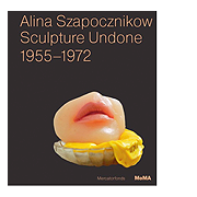
Since the start of February, the streets of Los Angeles have been graced by an uncanny image: a disembodied mouth with a woman's parted lips resting on what looks like a gob of gum in a scalloped glass dish. Even in Beverly Hills, these banners turn heads. They are ads for the exhibition Alina Szapocznikow: Sculpture Undone, on display at the Hammer Museum through 29 April, 2012, and traveling next to the Wexner Museum in Columbus, Ohio, and the Museum of Modern Art in New York. The mouth in the image is the artist's own, or rather a polyester resin cast: pink lips and alabaster skin glowing eerily, like a piece from a mannequin at Madame Tussaud's. The same sculpture, Small Dessert I (from a series of 1970–71), can be found on the cover of the exhibition's catalogue, and gives some indication of the carnality of the book's contents. Lips, breasts, and bellies abound, with a penis or two for good measure. Body parts are combined and multiplied, but hardly ever do these form a whole. This, after all, is Sculpture Undone.
Szapocznikow, who died in 1973, will not be known to most readers outside Poland, where she remains a figure of national importance. Separated from her family after 1945, Szapocznikow made her way to Prague, where she received her first formal training as a sculptor. In 1948 she moved to Paris to attend the École des Beaux-Arts, and was soon exhibiting her work together with other Polish expatriates. The brief period covered by the present exhibition, from 1955 to the artist's illness in 1972 (she would succumb to cancer the following year) finds her first back in Poland, where alongside a Monument to Polish-Soviet Friendship and an Allegory of Industry, Szapocznikow created Exhumed, an homage to the Hungarian political martyr László Rajk, which subverted both the Social-Realist style and the propagandistic sense of her public commissions. A faceless, lumpen bronze torso, Exhumed resembles the archeological casts of the anonymous victims of Pompeii. The figure's posture, with stumps suggesting bound arms, recalls the stooped supplication of Rodin's Burghers of Calais, while the unearthed body's scoured and pitted surface tells of violence and neglect. Exhumed also prefigures the fragmented figurative mode that would become Szapocznikow's principal means of expression. The synechdotal language of allegory is embodied—or more properly disembodied—in her 1957 Project for a Monument to the Heroes of the Warsaw Ghetto, a patinated plaster hand on a spindly cast-iron base; a symbol too ambivalent to be interpreted simply as a gesture of defiance. The Pop impulse which would progressively invade Szapocznikow's work, and bring her to prominence in Poland, also attracted the attention of Marcel Duchamp, who nominated her for a Copley Foundation prize in 1965 for a sculpture—part ready-made, part automaton, like the nude in Duchamps' Étant donnés assembled from automobile parts—entitled Goldfinger (the James Bond film of the same name had been released the previous year). It was in the following year, however, that Szapocznikow created the series of Mouths and Breasts, that are among the most arresting works in the present exhibition. In 1962, the artist had made a plaster cast of her right leg. Resting on its side, and terminating at the hip, it is an unlikely object of desire. As remarked by Cornelia Butler in her catalogue essay Soft Body/Soft Sculpture: The Gendered Surrealism of Alina Szapocznikow, Leg also anticipated the proto-Pop gesture of the French sculptor César, who exhibited his Thumb (an over life-size bronze cast of the artist's own digit) in Paris in 1965. Most importantly, Leg would introduce Szapocznikow to the practice of casting from life which she would continue to explore for the remaining fifteen years of her career.
In 1877, when a scandal was provoked by accusations that Auguste Rodin had cast his male nude, The Age of Bronze, from life, the practice undoubtedly carried the stigma of inauthenticity. Lip service is paid in Elena Filipovic's catalogue essay Photosculptural: Alina Szapocznikow's Index of the Body to André Bazin, Roland Barthes, and the indexical quality of the mechanically reproduced object, but these concerns seem far removed from the erotics of Szapocznikow's own works in series, such as her Illuminated Lips of 1966. Standing on tall stems, like Surrealist flowers, these functioning lamps form luminious, indescribably sensual counterparts to works such as Small Dessert I, whose tender translucence seems to wax in comparision.
The commodified lips (those of the artist herself, and her friends Arianne Raoul-Auval and the actress Julie Christie) and rosy nipples of the Mouths and Breasts series would culminate in Szapocznikow's most ambitious (and ultimately unrealized) monument to the cult of consumerism: Rolls Royce II, a twenty-five inch Portuguese marble reproduction of a 1930s Rolls-Royce drophead, which Szapocznikow conceived as a maquette for a life-size monument. "It will be very expensive," the artist inscribed on a plan for the proposed sculpture, "completely useless, and a reflection of the god of supreme luxury. In other words a 'complete' work of art." In the maquette, presented on a pedestal in the exhibition, the Spirit of Ecstasy (the iconic figurine inspired by the Nike of Samothrace) has been replaced by a brass hood ornament of the artist's own invention: a winged phallus. The motif of the erect penis, which—pink and vital—had formed the base of one of the lamps in the series Illuminated Lips, would be paired in 1971 with the pale marmoreal flesh of a fully-modeled female figurine in another small-scale work, The Mad Fiancée. With her arms hanging limply at her sides, and her torso supported by the head of the penis, the figure of the Mad Fiancée forms a bridge to one of Szapocznikow's last and strongest works: a full-body cast of her adult son Piotr in the same translucent polyester resin, which rests against the wall at a forty-five degree angle, like a fragile human plank. Executed in 1972, the year Szapocznikow was diagnosed with her fatal illness, it is an extraordinary portrait, Piotr's pose and long hair recalling a motherless Pietà. Unfortunately, like much of Szapocznikow's work, Piotr reproduces poorly in the catalogue, conveying little sense of the work's true presence. These are sculptures that demand to be seen in the flesh, and that owing to the too-brief span of the artist's life, and the judicious decisions of the exhibition's organizers, present a highly coherent body of work. In marked contrast to the expansive, and ultimately overwhelming exhibition on concurrently at the Los Angeles County Museum of Art, In Wonderland: The Surrealist Adventures of Woman Artists in Mexico and the United States, with which the Hammer exhibition invites comparison, Alina Szapocznikow: Sculpture Undone, leaves us wanting more.
Ariel Plotek
Back To ContentsThe Renaissance Portrait From Donatello to Bellini
Berlin | New York
Catalogue edited by Keith Christiansen and Stefan Weppelmann. New York: Metropolitan Museum of Art, 2011.

The exhibition of fifteenth-century Italian portraiture on display at the Metropolitan Museum of Art from 21 December, 2011, to 18 March, 2012, was a sumptuous affair: the organizers succeeded in bringing together an exquisite ensemble of works that span a variety of media (painting, sculptures in bronze and terracotta, and medals of various materials) as well as cultures. The curators made an interesting—and I think admirable—decision to stop short of 1500, even though moving beyond that watershed moment would have allowed them to incorporate more marketable names like Raphael and Titian. In its previous incarnation at Berlin's Bode Museum the exhibition included Leonardo da Vinci's Lady with an Ermine, though this picture was left out of the New York venue due to the loan's conflict with the blockbuster London exhibition dedicated to Leonardo's time at the Sforza court in Milan. While Lady with an Ermine is a superb painting and would have made a welcome addition to the New York show, its absence was ably handled by the curators, who acknowledged the important role that Leonardo played in the development of female portraiture through the inclusion of a portrait by Lorenzo di Credi, which is clearly inspired by Leonardo's Ginevra de'Benci. With this picture standing in for the monumental changes that occur in portraiture (especially female portraiture) toward the end of the fifteenth century, the exhibition is free to explore in greater detail the divergent strands of portraiture that developed throughout the quattrocento while avoiding sycophantic reverence for the "artist-genius" Leonardo. The absence of Leonardo's painting actually alleviates the pressure of the obvious teleological development implied by its display in Berlin and allows the exhibition to lean upon the quality of the objects themselves rather than drawing on a household name.
The roughly 150 works on display are generally of outstanding quality, and the curators should be commended for securing a number of important loans, including the portrait of Federigo da Montefeltro and his son Guidobaldo, both the Berlin and Frankfurt versions of Botticelli's so-called portraits of Simonetta Vespucci, and a significant number of paintings, medals, and drawings by Pisanello. The exhibition is displayed over eight rooms, the first four of which are dedicated to Florentine art and make a provocative suggestion about the origins of Renaissance portraiture by beginning the show with Donatello's Reliquary Bust of Saint Rossore (here presented as a "portrait" of the saint). Room one demonstrates the codification of the genre of the profile portrait through works by Masaccio, Domenico Veneziano, and a work attributed to Paolo Uccello. In the second room the theme shifts from codification to an examination of the unique challenge faced by artists tasked with representing a woman's virtue and beauty. In a rare treat, the two versions of Botticelli's Simonetta Vespucci are displayed next to each other; these ravishing paintings demonstrate the alliance between female beauty and the allure of the painter's craft. If there is a downside to the display of these marvelous pictures, it is that the visitor is left feeling that dessert may have been served before the main course. The Florentine material continues in the third room, which scrutinizes the role that portraits played in commemoration, particularly vis-à-vis the figure of Giuliano de'Medici, who was assassinated during the Pazzi conspiracy in April 1478. Similar concerns seem to motivate the fourth room, which can be thought of as a genealogical meditation focused on the aging head of the family (pater familias), a theme that was of evident concern within a (nominally) mercantile republic where filial piety was extolled as a civic virtue. Two portraits by Domenico Ghirlandaio make this point clear, as both pictures seek to render different aspects of cross-generational interactions within the Florentine Republic; this poignant grouping is a highlight of the exhibition.
The objects from the Italian courts are presented over two rooms, and one is immediately struck by the differences in size, scale, and medium which separate these objects from their Florentine counterparts. Having calibrated one's eye with the Florentine material, the persistence of images in profile right up until the turn of the sixteenth century is shocking; one wishes, however, for the perseverance of this motif to be unpacked in a critical manner by the curators. Here more than anywhere else the beholder longs for the inclusion of ancient materials, since Greco-Roman coins and portrait busts so clearly served as inspiration for the dynastic portraiture displayed here. The importance of hereditary concerns is evident in the emphasis placed on depicting young children: whereas Florentine familial piety manifested itself through a reverence for the elderly, court portraiture highlights the patrons' attempts to solidify often fragile genealogical claims to sovereignty by depicting the new generation. These youthful portraits are not studies in adolescent psychology or reflections on childhood, rather they are the visual currency of dynastic authority.
The curators note that the diffusion of portraiture in Venice was stymied by the Republic's unease with the exaltation of the individual over the city, hence the selection of objects is more limited both chronologically and artistically than in the other parts of the exhibition: here painting clearly dominates, and sculpture plays only a supporting role, while the rest of the exhibition maintains an admirable balance between paintings and sculptures. However, the transition from the courts to the Venetian material is disrupted by the inclusion of objects relating to foreign figures, including the Holy Roman Emperor Maximilian I and Frederick III, elector of Saxony. While these portraits are impressive, the motives behind their inclusion were not clearly spelled out in the didactic materials and leave the visitor perplexed. Similarly, works by Andrea Mantegna confusingly appear in both sections two and three, while the works of Antonello da Messina are grouped with the Venetian material despite the fact that at least one of the pictures appears to pre-date Antonello's Venetian sojourn. This raises the question: what of quattrocento portraiture in Southern Italy? While "the courts" notionally includes Naples, other southern locales like Rome, Calabria, and Sicily are left untouched and would have rewarded greater examination.
The lavish accompanying catalogue opens with five thematic essays by leading scholars in the field that frame the exhibition: Patricia Rubin, Beverly Louise Brown, and Peter Humfrey contribute essays on portraiture in Florence, the courts, and Venice, respectively. Stefan Weppelmann, by contrast, offers broader reflections on the referential capacity of "portraiture" and its relationship to sacred images, while Rudolph Preimesberger expounds upon the variable language used to characterize what we would now call "portraits" in a period before such a term existed. Weppelmann's essay reinforces the claims that are asserted in the exhibition's first room, where Donatello's "portrait" of Saint Rossore marks the starting point for the exhibition. When removed from its proper ecclesiastical context and placed on a pedestal in a museum the reliquary bust does reveal certain similarities with the portraits that surround it. Weppelmann, though, goes further, suggesting that "Secular portraits were viewed with eyes accustomed to seeing those of saints, in which resemblance and hierarchical rank were not at issue. This fact served to elaborate pictorial strategies in which the medium was employed not so much to achieve a lifelike resemblance as to evoke within a portrait mode an iconic work in which a secular subject acquires the aura of a cult image." This is a large claim that glides over the contentious question of the interrelation between portraits and icons in the visual economy of Renaissance Italy, and it is complicated by the reverence for ancient ruler portraits clearly communicated by so many of the images on display. Indeed, ancient portraits are remarkably absent from this exhibition; when ancient artifacts do make an appearance it is usually through a Renaissance "surrogate," such as the early-sixteenth-century copy of the "Seal of Nero" displayed near the portraits of Simonetta Vespucci. The exhibition might have proposed a more robust understanding of the scope of Renaissance portraiture by examining how both the ancient ruler portrait and "portraits" of medieval saints contributed to the emergence of a new category of images in which questions of presence, absence, likeness, and aura were transposed onto the visages of contemporary individuals.
The individual catalogue entries are informative and offer high-quality color reproductions of all of the works on display (and even some that are not displayed, presumably because the loans were pulled at the last minute, though this is not noted in the volume). However, it will be difficult for future generations to understand how the show was hung based solely on the catalogue. While the objects are grouped into three sections representing Florence, the courts, and Venice, their organization within those sections rarely corresponds to how the objects were organized in the exhibition. Likewise, the catalogue entries of some objects seem to have migrated into another section altogether, like the catalogue entry on Cosimo Rosselli's Portrait of a Man, which appears in the section on the courts. This exhibition, though, does an admirable job of communicating to the visitor the tension that exists between the "standards" that defined the genre of portraiture in fifteenth-century Italy and the drive to personalization and specificity that underwrote the creation of each of these images. Unfettered by a teleological approach culminating in the (fictional) emergence of the modern artist-genius, this exhibition captures the variety of fifteenth-century Italian portraits while allowing the works to enthrall the beholder, effectively conveying the allure of this mysterious category of images that remains with us to this day.
Christopher Nygren
Back To ContentsCrosscurrents in Painting and Sculpture in LA, 1950–1970
Los Angeles
Pacific Standard Time, Los Angeles Art 1945–1980, catalogue edited by Rebecca Peabody. Los Angeles: Getty Center, 2011.
Phenomenal
La Jolla and San Diego
Catalogue edited by Robin Clark. San Diego: Museum of Contemporary Art San Diego, 2011

Every artist I know likes to have a chance to see how the work they have done stands up in competition with the peers of their youth. For me, it is another dimension of the studio activities; a dimension that is palpable in the context of a big crowded room that is not my studio. Normally, I do not like big survey shows because the depth of the artists work is totally subsumed by brevity.
Pacific Standard Time took this brevity to an almost surreal level. The selections were less about the history of studio activities than the history of selection. For the general audience I would think the Pacific Standard Time effort was a colossal success. Most of the people that witnessed the events were given a taste of the flavors of the decades selected, and the work was delicious.
It would have been more interesting for me to see more of everyone's work, because what I saw was in general the most obvious and familiar objects by those artists selected to be part of the project. I wanted more of everything!
I found my piece of this action ironically different. In Phenomenal, at the Museum of Contemporary Art San Diego's two venues, I was well covered for the decades in question, and I was delighted to see things I had made when I was a kid. The thing that most amazed me about the works gathered in La Jolla was that these were extraordinarily cohesive. Different degrees of sophistication and improbability told their own story. I had never seen the work in the kind of depth that I was accorded, and for this I am most grateful.
I have always worked on more than one project at a time, and I was able to see the struggle for a sense of symmetry and completion in the early studies. Years of this struggle finally led to the conclusion that there is no completion. I was able to remember the moment that I realized "I will never finish this shit unless I make it simpler."
My works in the Getty Center's Crosscurrents in Painting and Sculpture in LA, 1950–1970 were two delicious examples. They both belong to roughly the same time period. The cube was an example, although it was not my best example, of surface and absorbed light. All the larger cubes were studies of a volume of light that sat with unquestioned authority of weight and mass. The smaller cubes floated on light.
In the wall piece I tried to slice the light in the wall like an egg slicer might using the parts as both reflecting and absorbing. This example formed part of an improvisational environmental assembly. There were probably one hundred parts to the original body of work. It was designed to surround you. Over the short period I worked on this piece most of the parts were destroyed. The earthquake of 1971 took care of the rest. I had a lot of memories when we installed it at the Getty. I had not seen the sliced wall in roughly forty years.
My ambition changed abruptly after 1970, as did my move to simplify. I am a hands-on artist, and I like to make things that are totally dependent on the quality of the surfaces. I don't think about much else. I don't have to, the work is the teacher, I follow the work. I liked Pacific Standard Time, it made me think about myself in a way I rarely do.
Larry Bell
Back To Contents